Nomadic Rebrand
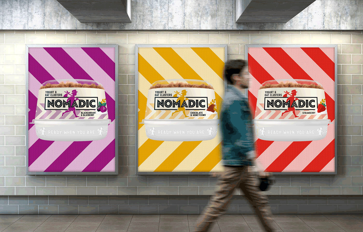
We re-positioned the brand to an entirely new audience, delivering a brand spanking new identity, with distinctive assets including the iconic boy icon, powerful colours and purposeful chevron pattern to link to our audiences hard working world. Outputs included logo, toolkit, website and packaging across all ranges.